Custom Node Types

Coalesce comes with several out-of-the-box node types ready for common data transformations, but one can also create their own custom nodes with further customizations using YAML, Jinja 2, and SQL.

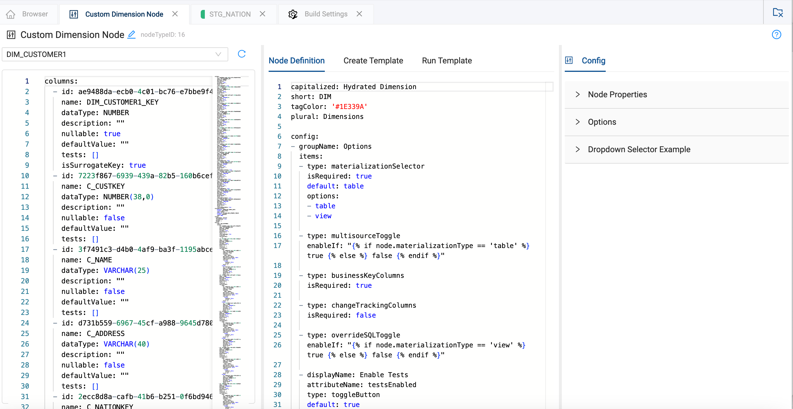
The Node Definition defines the UI elements and other shared attributes available to that Node Type. The metadata generated by these UI elements along with the columns in the Mapping View is available to the Create and Run Templates. The Create Template is responsible for generating the table or view's structure (DDL), while the Run Template populates the table or view with data (DML).

To make your own Node Type, go to Build Settings>Node Types and select New Node Type to start from scratch or Duplicate on any Node Type to extend existing functionality.

Components of a Custom Node Type

Once in the Node Type editor, you'll be introduced to the core components of the Node Type, which include the following:

Create Template

A Create Template (optional) is a template that defines the creation of the table's structure, and is equivalent to DDL.

Below is a simple (static) example of a Create Template that will create an empty table with two columns.

Create Template Example (simple)
{{ stage('Create Stage Table') }}
CREATE OR REPLACE TABLE {{ ref_no_link(node.location.name, node.name) }}
(
"MY_COLUMN" NUMBER(38,0),
"MY_COLUMN2" NUMBER(38, 0)
)

Below is a more complex (dynamic) example, where the columns of the source node are created using the underlying metadata for the current node. Null values, default values, and the description column are being processed accordingly to create a DDL SQL statement and resulting table.

Create Template Example (complex)
{{ stage('Create Stage Table') }}
CREATE OR REPLACE TABLE {{ ref_no_link(node.location.name, node.name) }}
(
{% for col in columns %}
"{{ col.name }}" {{ col.dataType }}
{%- if not col.nullable %} NOT NULL
{%- if col.defaultValue | length > 0 %} DEFAULT {{ col.defaultValue }}{% endif %}
{% endif %}
{%- if col.description | length > 0 %} COMMENT '{{ col.description }}'{% endif %}
{%- if not loop.last -%}, {% endif %}
{% endfor %}
)

Run Template

A Run Template (optional) is a template that defines how the table will be populated with data and is equivalent to DML.

Below is a simple (static) example Run Template that corresponds to the previous simple Create Template and adds one value to each column.

Run Template Example (simple)
{{ stage('Insert Into Table') }}
INSERT INTO {{ ref_no_link(node.location.name, node.name) }}
(
"MY_COLUMN",
"MY_COLUMN2"
)
VALUES(
3,
4
)

Below is a more complex (dynamic) example, looping through all the sources, and source columns, applying transformations, and ultimately creating a DML statement.

Run Template Example (complex)
{% for source in sources %}
{{ stage('Insert into Table') }}
INSERT INTO {{ ref_no_link(node.location.name, node.name) }}
(
{% for col in source.columns %}
"{{ col.name }}"
{%- if not loop.last -%},{% endif %}
{% endfor %}
)
SELECT
{% for col in source.columns %}
{{ get_source_transform(col) }} AS "{{ col.name }}"
{%- if not loop.last -%}, {% endif %}
{% endfor %}
{{ source.join }}
{% endfor %}

Node Definition

Written in YAML, the Node Definition is where you specify the UI elements and other configurations that should be available for Nodes of this Node Type. This includes aspects like the node's color, its materialization options (table or view), its business keys, and more.

Node Definition Example

Below is an annotated example specification with one of each type of UI element, and can be used as a starting point when creating your own node type. You can find more details about each of these options on our Node Config Options page.

Node Definition Example
capitalized: 'My Node Name'                      # Common Name (string, required)
short: 'MNN' # Node prefix. A '_' delimiter will be added automatically. (string, required)
plural: 'My Node Names' # plural name of common name (string, required)
tagColor: '#FF5A5F' # Node color. CSS colors or hex colors (string, required)
deployStrategy: default # Deployment strategy - see separate article for details.
isColumnResyncEnabled: true # Allow non-source columns to be resynced.

config: # Array of the following config items
- groupName: 'Core UI Elements' # Name of config group (string, required)
description: 'Core UI Elements' # Description of group. Displayed in the GUI (string)
enableIf: 'true' # If true, display this config group, else hide this config group.
# Jinja expression resulting in a quoted boolean may be used for dynamic behavior
# (boolean string, 'true' | 'false', defaults 'true')

items: # This will be followed by all your config items/UI elements for the given group (array, required)

## Core UI Elements ##
- type: businessKeyColumns # Selector for business key columns
displayName: 'Business Key' # displayName for type businessKeyColumns (cannot be modified by user)
attributeName: 'isBusinessKey' # attributeName for type businessKeyColumns (cannot be modified by user)
isRequired: false # Require input from user for this config element (boolean, defaults false)
enableIf: 'true' # If true, display this element, else hide this element.
# Jinja expression resulting in a quoted boolean may be used for dynamic behavior
# (boolean string, 'true' | 'false', defaults 'true')

- type: materializationSelector # Dropdown selector for materialization options
default: 'table' # Default selection (string)
options: # Materialization options allowed for this node. (array of strings 'table' | 'view')
- 'table'
- 'view'
isRequired: false # If a config item is required (boolean, defaults false)
enableIf: 'true' # If true, display this element, else hide this element.
# Jinja expression resulting in a quoted boolean may be used for dynamic behavior
# (boolean string, 'true' | 'false', defaults 'true')

- type: multisourceToggle
displayName: 'Multi Source' # displayName for type multisourceToggle (cannot be modified by user)
attributeName: 'node.isMultisource' # attributeName for type multisourceToggle (cannot be modified by user)
enableIf: 'true' # If true, display this element, else hide this element.
# Jinja expression resulting in a quoted boolean may be used for dynamic behavior
# (boolean string, 'true' | 'false', defaults 'true')

- type: overrideSQLToggle # Enables GUI input for DDL SQL
displayName: 'Override Create SQL' # displayName for type overrideSQLToggle (cannot be modified by user)
attributeName: 'node.override.create' # attributeName for type overrideSQLToggle (cannot be modified by user)
enableIf: 'true' # If true, display this element, else hide this element.
# Jinja expression resulting in a quoted boolean may be used for dynamic behavior
# (boolean string, 'true' | 'false', defaults 'true')

- type: changeTrackingColumns # Selector for change tracking columns
displayName: 'Change Tracking' # displayName for type changeTrackingColumns (cannot be modified by user)
attributeName: 'isChangeTracking' # attributeName for type changeTrackingColumns (cannot be modified by user)
isRequired: false # If a config item is required (boolean, defaults false)
enableIf: 'true' # If true, display this element, else hide this element.
# Jinja expression resulting in a quoted boolean may be used for dynamic behavior
# (boolean string, 'true' | 'false', defaults 'true')

- groupName: 'User-defined UI Elements' # Name of config group (string, required)
description: 'User-defined UI Elements' # Description of group. Displayed in the GUI (string)
enableIf: 'true' # If true, display this config group, else hide this config group
# Jinja expression resulting in a quoted boolean may be used for dynamic behavior
# (boolean string, 'true' | 'false', defaults 'true')
items: # This will be followed by all your config items/UI elements for the given group (array, required)

# User-defined UI Elements
- type: toggleButton # Toggle button
displayName: 'My Button' # GUI display name (string, required)
attributeName: 'button' # Name of element used in templates (string, required)
enableIf: 'true' # If true, display this element, else hide this element.
# Jinja expression resulting in a quoted boolean may be used for dynamic behavior
# (boolean string, 'true' | 'false', defaults 'true')

- type: dropdownSelector # Dropdown of options
displayName: 'My Dropdown Selector' # GUI display name (string, required)
attributeName: 'dropdown' # Name of element used in templates (string, required)
default: 'option 1' # Default selection (string)
options: # Dropdown options (array of strings, required)
- 'option 1'
- 'option 2'
isRequired: false # If a config item is required (boolean, defaults false)
enableIf: 'true' # If true, display this element, else hide this element.
# Jinja expression resulting in a quoted boolean may be used for dynamic behavior
# (boolean string, 'true' | 'false', defaults 'true')

- type: columnSelector # Transfer config element for selecting multiple columns from the mapping grid
displayName: 'My Multi Column Selector' # GUI display name (string, required)
attributeName: 'columnSelector' # Name of element used in templates (string, required)
isRequired: false # If a config item is required (boolean, defaults false)
enableIf: 'true' # If true, display this element, else hide this element.
# Jinja expression resulting in a quoted boolean may be used for dynamic behavior
# (boolean string, 'true' | 'false', defaults 'true')


- type: textBox # Generic textbox
displayName: 'My Textbox' # GUI display name (string, required)
attributeName: 'textbox' # Name of element used in templates (string, required)
syntax: 'none' # Syntax highlighting in text box (string, defaults 'none', 'none' | 'sql')
isRequired: false # If a config item is required (boolean, defaults false)
enableIf: 'true' # If true, display this element, else hide this element.
# Jinja expression resulting in a quoted boolean may be used for dynamic behavior
# (boolean string, 'true' | 'false', defaults 'true')

- type: tabular # Tabular config option. Combines multiple config elements into a single table-like structure
displayName: 'My Tabular Config' # GUI display name (string, required)
attributeName: 'myTabularConfig' # Name of element used in templates (string, required)
columns: # Array of config element types
# (array, toggleButton | dropdownSelector | columnDropdownSelector | textBox, required)
- type: toggleButton # Toggle button
displayName: 'My Button' # GUI display name (string, required)
attributeName: 'tabToggleButton' # Name of element used in templates (string, required)
enableIf: 'true' # If true, display this element, else hide this element.
# Jinja expression resulting in a quoted boolean may be used for dynamic behavior
# (boolean string, 'true' | 'false', defaults 'true')

- type: dropdownSelector # Dropdown of options
displayName: 'My Dropdown Selector' # GUI display name (string, required)
attributeName: 'tabDropdown' # Name of element used in templates (string, required)
default: 'option 1' # Default selection (string)
options: # Dropdown options (array of strings, required)
- 'option 1'
- 'option 2'
isRequired: false # If a config item is required (boolean, defaults false)
enableIf: 'true' # If true, display this element, else hide this element.
# Jinja expression resulting in a quoted boolean may be used for dynamic behavior
# (boolean string, 'true' | 'false', defaults 'true')

- type: textBox # Generic textbox
displayName: 'My Textbox' # GUI display name (string, required)
attributeName: 'tabTextbox' # Name of element used in templates (string, required)
syntax: 'none' # Syntax highlighting in text box (string, defaults 'none', 'none' | 'sql')
isRequired: false # If a config item is required (boolean, defaults false)
enableIf: 'true' # If true, display this element, else hide this element.
# Jinja expression resulting in a quoted booelan may be used for dynamic behavior
# (boolean string, 'true' | 'false', defaults 'true')

isRequired: false # If a config item is required (boolean, defaults false)
enableIf: 'true' # If true, display this element, else hide this element.
# Jinja expression resulting in a quoted booelan may be used for dynamic behavior
# (boolean string, 'true' | 'false', defaults 'true')

- groupName: 'Customizable Core UI Elements' # Name of config group (string, required)
description: 'Customizable Core UI Elements' # Description of group. Displayed in the GUI (string)
enableIf: 'true' # If true, display this config group, else hide this config group.
# Jinja expression resulting in a quoted boolean may be used for dynamic behavior
# (boolean string, 'true' | 'false', defaults 'true')
items: # This will be followed by all your config items/UI elements for the given group (array, required)

## Customizable Core UI Elements ##
- type: dropdownSelector # Select the insert strategy for multisource nodes. Leveraged by Coalesce default Node Types
displayName: 'Multisource Strategy' # Config element name (string, required)
attributeName: 'insertStrategy' # Name of element used in templates (string, required)
default: 'INSERT' # Default selection (string)
options: # Dropdown options (array of strings, required)
- 'INSERT'
- 'UNION'
- 'UNION ALL'

isRequired: false # If a config item is required (boolean, defaults false)
enableIf: 'true' # If true, display this element, else hide this element.
# Jinja expression resulting in a quoted boolean may be used for dynamic behavior
# (boolean string, 'true' | 'false', defaults 'true')

- type: toggleButton # Enable or disable truncate before running. Leveraged by Coalesce default Stage Node Type
displayName: 'Truncate Before' # GUI display name (string, required)
attributeName: 'truncateBefore' # Name of element used in templates (string, required)
enableIf: 'true' # If true, display this element, else hide this element.
# Jinja expression resulting in a quoted boolean may be used for dynamic behavior
# (boolean string, 'true' | 'false', defaults 'true')

- type: toggleButton # Enable tests to be run. Leveraged by Coalesce default Node Types
displayName: 'Enable Tests' # GUI display name (string, required)
attributeName: 'testsEnabled' # Name of element used in templates (string, required)
default: true # Element default state (boolean)
enableIf: 'true' # If true, display this element, else hide this element.
# Jinja expression resulting in a quoted boolean may be used for dynamic behavior
# (boolean string, 'true' | 'false', defaults 'true')

- type: textBox # SQL to be executed before run
displayName: 'Pre-SQL' # GUI display name (string, required)
attributeName: 'preSQL' # Name of element used in templates (string, required)
syntax: 'sql' # Syntax highlighting in text box (string, defaults 'none', 'none' | 'sql')
isRequired: false # If a config item is required (boolean, defaults false)
enableIf: 'true' # If true, display this element, else hide this element.
# Jinja expression resulting in a quoted boolean may be used for dynamic behavior
# (boolean string, 'true' | 'false', defaults 'true')

- type: textBox # SQL to be executed after run
displayName: 'Post-SQL' # GUI display name (string, required)
attributeName: 'postSQL' # Name of element used in templates (string, required)
syntax: 'sql' # Syntax highlighting in text box (string, defaults 'none', 'none' | 'sql')
isRequired: false # If a config item is required (boolean, defaults false)
enableIf: 'true' # If true, display this element, else hide this element.
# Jinja expression resulting in a quoted boolean may be used for dynamic behavior
# (boolean string, 'true' | 'false', defaults 'true')


systemColumns: # Additional columns (rows in mapping grid) to initialize the node with (array of columns objects)
- displayName: 'SYSTEM_COLUMN_1' # Column display name (string, required)
# '{{NODE_NAME}}' token can be used in the displayName to reference the name of the current node
attributeName: 'systemColumn1' # Name of element used in templates (string, required)
transform: '1' # Initialized transform value of system column (string, required)
dataType: 'NUMBER' # SQL data type (string, required)
placement: 'beginning' # Determines placement of system column in relation to normal columns. (string, 'beginning' | 'end')

mappingColumns: # Adds additional columns to the mapping grid for additional metadata per node-column
- type: textBox # Generic textbox in mapping grid
headerName: 'My Header' # GUI display name (string, required)
attributeName: 'myMappingColumn' # Name of element used in templates (string, required)

Deployment Strategy

For more details on deploymentStrategy, see our Deployment Strategies article.

Join Templates

The Coalesce platform generates a Join string by default when a node is initialized or when a user triggers a Generate Join. This uses the dependencies of the node to generate a generic JOIN string using INNER JOIN. However, for more complex use cases, users may wish to customize the behavior by using a Join Template that generates the JOIN string based on the metadata of the node.

Working with Refs

To ensure that Coalesce captures dependencies from the compiled Join string, the ref syntax must be left un-rendered as part of the Join Template. This presents a challenge since we need to render part of the Jinja, but exclude the ref. To address this challenge, the Join template will only render to a depth of 1, which is inconsistent with other Jinja templates found elsewhere in the app that recursively render Jinja until no Jinja is left.

The following macros can be utilized to render un-rendered ref calls. To use these macros they must be added to your Workspace under Build Settings>Macros.

Jinja2
{%- macro ref_raw(location_name, node_name) -%}
{% raw %}{{ ref('{% endraw %}{{ location_name }}{% raw %}', '{% endraw %}{{ node_name }}{% raw %}') }}{% endraw %}
{%- endmacro -%}

{%- macro ref_no_link_raw(location_name, node_name) -%}
{% raw %}{{ ref_no_link('{% endraw %}{{ location_name }}{% raw %}', '{% endraw %}{{ node_name }}{% raw %}') }}{% endraw %}
{%- endmacro -%}

{%- macro ref_link_raw(location_name, node_name) -%}
{% raw %}{{ ref_link('{% endraw %}{{ location_name }}{% raw %}', '{% endraw %}{{ node_name }}{% raw %}') }}{% endraw %}
{%- endmacro -%}

Here's an example of using ref_raw to generate a very simple Join string using the Join Template:

Use ref_raw for a Join
capitalized: 'My Node Name'
short: 'MNN'
plural: 'My Node Names'
tagColor: '#FF5A5F'

joinTemplate: |
{%- for dep in sources[0].dependencies -%}
{%- if loop.first %} FROM {% endif -%}
{%- if not loop.first %}LEFT JOIN {% endif -%}
{{- ref_raw(dep.node.location.name, dep.node.name) }} {{ dep.node.name }}
{% if not loop.first %} ON {{ sources[0].dependencies[loop.index0].node.name }}./*COLUMN*/ = {{ sources[0].dependencies[loop.index0 - 1].node.name }}./*COLUMN*/ {%- endif %}
{% endfor -%}

WHERE 1=1

Stage-Based Templates

Node Type templates typically generate one or many SQL execution queries, which Coalesce refers to as Stages. Stages allow Coalesce to run multiple queries against the data warehouse while providing additional runtime behavior and tracking metrics about individual SQL executions.

For example, you may decide to output a TRUNCATE and a MERGE statements as individual stages, using Jinja to render stages at the appropriate time conditionally.

Coalesce then reads these outputted stages and executes each of the stages one by one, tracking each statement's progress and data results.

A Stage only needs to be declared at the beginning of the query. A Stage ends either at the beginning of the next declared Stage or at the end of the template.

To declare a Stage, use the following syntax. {{ stage('My Stage Name') }}

Custom Node Types Walkthrough Video

For a walkthrough on creating a User-defined Node or Custom Node Type, take a look at our video.

Custom Nodes Best Practices

  • isRequired and toggles
    • The isRequired parameter is not valid for toggles.
  • Adding or Modifying System Columns
    • System columns are only added to a node when the node is first created on the graph. When adding new system columns to a UDN, these system columns will not immediately be available in the metadata of the current node you are editing.
    • For these changes to take effect, you must create a new node of this type on your graph. You must select this new node in the Node Type Editor to continue authoring it.