Documentation index: llms.txt. This page is also available as markdown: append .md to this URL or send Accept: text/markdown.
Node Definition Reference
Node configuration options determine the behavior of an individual node.
Node Definition Example
capitalized: 'My Node Name' # Common Name (string, required)
short: 'MNN' # Node prefix. A '_' delimiter will be added automatically. (string, required)
plural: 'My Node Names' # plural name of common name (string, required)
tagColor: '#FF5A5F' # Node color. CSS colors or hex colors (string, required)
deployStrategy: default # Deployment strategy - see separate article for details.
isColumnResyncEnabled: true # Allow non-source columns to be re-synced.
config: # Array of the following config items
- groupName: 'Core UI Elements' # Name of config group (string, required)
description: 'Core UI Elements' # Description of group. Displayed in the GUI (string)
enableIf: 'true' # If true, display this config group, else hide this config group.
# Jinja expression resulting in a quoted boolean may be used for dynamic behavior
# (boolean string, 'true' | 'false', defaults 'true')
items: # This will be followed by all your config items/UI elements for the given group (array, required)
## Core UI Elements ##
- type: businessKeyColumns # Selector for business key columns
displayName: 'Business Key' # displayName for type businessKeyColumns (cannot be modified by user)
attributeName: 'isBusinessKey' # attributeName for type businessKeyColumns (cannot be modified by user)
isRequired: false # Require input from user for this config element (boolean, defaults false)
enableIf: 'true' # If true, display this element, else hide this element.
# Jinja expression resulting in a quoted boolean may be used for dynamic behavior
# (boolean string, 'true' | 'false', defaults 'true')
- type: note # Add a text element anywhere in the configuration.
attributeName: 'note.attribute' # Can be user set
displayName: 'Add text here'
enableIf: "{% if node.materializationType == 'view' %}
false {% else %} true {% endif %}" # Jinja expression resulting in a quoted boolean may be used for dynamic behavior
- type: materializationSelector # Dropdown selector for materialization options
default: 'table' # Default selection (string)
options: # Materialization options allowed for this node. (array of strings 'table' | 'view')
- 'table'
- 'view'
isRequired: false # If a config item is required (boolean, defaults false)
enableIf: 'true' # If true, display this element, else hide this element.
# Jinja expression resulting in a quoted boolean may be used for dynamic behavior
# (boolean string, 'true' | 'false', defaults 'true')
- type: multisourceToggle
displayName: 'Multi Source' # displayName for type multisourceToggle (cannot be modified by user)
attributeName: 'node.isMultisource' # attributeName for type multisourceToggle (cannot be modified by user)
enableIf: 'true' # If true, display this element, else hide this element.
# Jinja expression resulting in a quoted boolean may be used for dynamic behavior
# (boolean string, 'true' | 'false', defaults 'true')
- type: overrideSQLToggle # Enables GUI input for DDL SQL
displayName: 'Override Create SQL' # displayName for type overrideSQLToggle (cannot be modified by user)
attributeName: 'node.override.create' # attributeName for type overrideSQLToggle (cannot be modified by user)
enableIf: 'true' # If true, display this element, else hide this element.
# Jinja expression resulting in a quoted boolean may be used for dynamic behavior
# (boolean string, 'true' | 'false', defaults 'true')
- type: changeTrackingColumns # Selector for change tracking columns
displayName: 'Change Tracking' # displayName for type changeTrackingColumns (cannot be modified by user)
attributeName: 'isChangeTracking' # attributeName for type changeTrackingColumns (cannot be modified by user)
isRequired: false # If a config item is required (boolean, defaults false)
enableIf: 'true' # If true, display this element, else hide this element.
# Jinja expression resulting in a quoted boolean may be used for dynamic behavior
# (boolean string, 'true' | 'false', defaults 'true')
- groupName: 'User-defined UI Elements' # Name of config group (string, required)
description: 'User-defined UI Elements' # Description of group. Displayed in the GUI (string)
enableIf: 'true' # If true, display this config group, else hide this config group
# Jinja expression resulting in a quoted boolean may be used for dynamic behavior
# (boolean string, 'true' | 'false', defaults 'true')
items: # This will be followed by all your config items/UI elements for the given group (array, required)
# User-defined UI Elements
- type: toggleButton # Toggle button
displayName: 'My Button' # GUI display name (string, required)
attributeName: 'button' # Name of element used in templates (string, required)
enableIf: 'true' # If true, display this element, else hide this element.
# Jinja expression resulting in a quoted boolean may be used for dynamic behavior
# (boolean string, 'true' | 'false', defaults 'true')
- type: dropdownSelector # Dropdown of options
displayName: 'My Dropdown Selector' # GUI display name (string, required)
attributeName: 'dropdown' # Name of element used in templates (string, required)
default: 'option 1' # Default selection (string)
options: # Dropdown options (array of strings, required)
- 'option 1'
- 'option 2'
isRequired: false # If a config item is required (boolean, defaults false)
enableIf: 'true' # If true, display this element, else hide this element.
# Jinja expression resulting in a quoted boolean may be used for dynamic behavior
# (boolean string, 'true' | 'false', defaults 'true')
- type: columnSelector # Transfer config element for selecting multiple columns from the mapping grid
displayName: 'My Multi Column Selector' # GUI display name (string, required)
attributeName: 'columnSelector' # Name of element used in templates (string, required)
isRequired: false # If a config item is required (boolean, defaults false)
enableIf: 'true' # If true, display this element, else hide this element.
# Jinja expression resulting in a quoted boolean may be used for dynamic behavior
# (boolean string, 'true' | 'false', defaults 'true')
- type: textBox # Generic textbox
displayName: 'My Textbox' # GUI display name (string, required)
attributeName: 'textbox' # Name of element used in templates (string, required)
syntax: 'none' # Syntax highlighting in text box (string, defaults 'none', 'none' | 'sql')
isRequired: false # If a config item is required (boolean, defaults false)
enableIf: 'true' # If true, display this element, else hide this element.
# Jinja expression resulting in a quoted boolean may be used for dynamic behavior
# (boolean string, 'true' | 'false', defaults 'true')
- type: tabular # Tabular config option. Combines multiple config elements into a single table-like structure
displayName: 'My Tabular Config' # GUI display name (string, required)
attributeName: 'myTabularConfig' # Name of element used in templates (string, required)
columns: # Array of config element types
# (array, toggleButton | dropdownSelector | columnDropdownSelector | textBox, required)
- type: toggleButton # Toggle button
displayName: 'My Button' # GUI display name (string, required)
attributeName: 'tabToggleButton' # Name of element used in templates (string, required)
enableIf: 'true' # If true, display this element, else hide this element.
# Jinja expression resulting in a quoted boolean may be used for dynamic behavior
# (boolean string, 'true' | 'false', defaults 'true')
- type: dropdownSelector # Dropdown of options
displayName: 'My Dropdown Selector' # GUI display name (string, required)
attributeName: 'tabDropdown' # Name of element used in templates (string, required)
default: 'option 1' # Default selection (string)
options: # Dropdown options (array of strings, required)
- 'option 1'
- 'option 2'
isRequired: false # If a config item is required (boolean, defaults false)
enableIf: 'true' # If true, display this element, else hide this element.
# Jinja expression resulting in a quoted boolean may be used for dynamic behavior
# (boolean string, 'true' | 'false', defaults 'true')
- type: textBox # Generic textbox
displayName: 'My Textbox' # GUI display name (string, required)
attributeName: 'tabTextbox' # Name of element used in templates (string, required)
syntax: 'none' # Syntax highlighting in text box (string, defaults 'none', 'none' | 'sql')
isRequired: false # If a config item is required (boolean, defaults false)
enableIf: 'true' # If true, display this element, else hide this element.
# Jinja expression resulting in a quoted booelan may be used for dynamic behavior
# (boolean string, 'true' | 'false', defaults 'true')
isRequired: false # If a config item is required (boolean, defaults false)
enableIf: 'true' # If true, display this element, else hide this element.
# Jinja expression resulting in a quoted booelan may be used for dynamic behavior
# (boolean string, 'true' | 'false', defaults 'true')
- groupName: 'Customizable Core UI Elements' # Name of config group (string, required)
description: 'Customizable Core UI Elements' # Description of group. Displayed in the GUI (string)
enableIf: 'true' # If true, display this config group, else hide this config group.
# Jinja expression resulting in a quoted boolean may be used for dynamic behavior
# (boolean string, 'true' | 'false', defaults 'true')
items: # This will be followed by all your config items/UI elements for the given group (array, required)
## Customizable Core UI Elements ##
- type: dropdownSelector # Select the insert strategy for multisource nodes. Leveraged by Coalesce default Node Types
displayName: 'Multisource Strategy' # Config element name (string, required)
attributeName: 'insertStrategy' # Name of element used in templates (string, required)
default: 'INSERT' # Default selection (string)
options: # Dropdown options (array of strings, required)
- 'INSERT'
- 'UNION'
- 'UNION ALL'
isRequired: false # If a config item is required (boolean, defaults false)
enableIf: 'true' # If true, display this element, else hide this element.
# Jinja expression resulting in a quoted boolean may be used for dynamic behavior
# (boolean string, 'true' | 'false', defaults 'true')
- type: toggleButton # Enable or disable truncate before running. Leveraged by Coalesce default Stage Node Type
displayName: 'Truncate Before' # GUI display name (string, required)
attributeName: 'truncateBefore' # Name of element used in templates (string, required)
enableIf: 'true' # If true, display this element, else hide this element.
# Jinja expression resulting in a quoted boolean may be used for dynamic behavior
# (boolean string, 'true' | 'false', defaults 'true')
- type: toggleButton # Enable tests to be run. Leveraged by Coalesce default Node Types
displayName: 'Enable Tests' # GUI display name (string, required)
attributeName: 'testsEnabled' # Name of element used in templates (string, required)
default: true # Element default state (boolean)
enableIf: 'true' # If true, display this element, else hide this element.
# Jinja expression resulting in a quoted boolean may be used for dynamic behavior
# (boolean string, 'true' | 'false', defaults 'true')
- type: textBox # SQL to be executed before run
displayName: 'Pre-SQL' # GUI display name (string, required)
attributeName: 'preSQL' # Name of element used in templates (string, required)
syntax: 'sql' # Syntax highlighting in text box (string, defaults 'none', 'none' | 'sql')
isRequired: false # If a config item is required (boolean, defaults false)
enableIf: 'true' # If true, display this element, else hide this element.
# Jinja expression resulting in a quoted boolean may be used for dynamic behavior
# (boolean string, 'true' | 'false', defaults 'true')
- type: textBox # SQL to be executed after run
displayName: 'Post-SQL' # GUI display name (string, required)
attributeName: 'postSQL' # Name of element used in templates (string, required)
syntax: 'sql' # Syntax highlighting in text box (string, defaults 'none', 'none' | 'sql')
isRequired: false # If a config item is required (boolean, defaults false)
enableIf: 'true' # If true, display this element, else hide this element.
# Jinja expression resulting in a quoted boolean may be used for dynamic behavior
# (boolean string, 'true' | 'false', defaults 'true')
systemColumns: # Additional columns (rows in mapping grid) to initialize the node with (array of columns objects)
- displayName: 'SYSTEM_COLUMN_1' # Column display name (string, required)
# '{{NODE_NAME}}' token can be used in the displayName to reference the name of the current node
attributeName: 'systemColumn1' # Name of element used in templates (string, required)
transform: '1' # Initialized transform value of system column (string, required)
dataType: 'NUMBER' # SQL data type (string, required)
placement: 'beginning' # Determines placement of system column in relation to normal columns. (string, 'beginning' | 'end')
mappingColumns: # Adds additional columns to the mapping grid for additional metadata per node-column
- type: textBox # Generic textbox in mapping grid
headerName: 'My Header' # GUI display name (string, required)
attributeName: 'myMappingColumn' # Name of element used in templates (string, required)
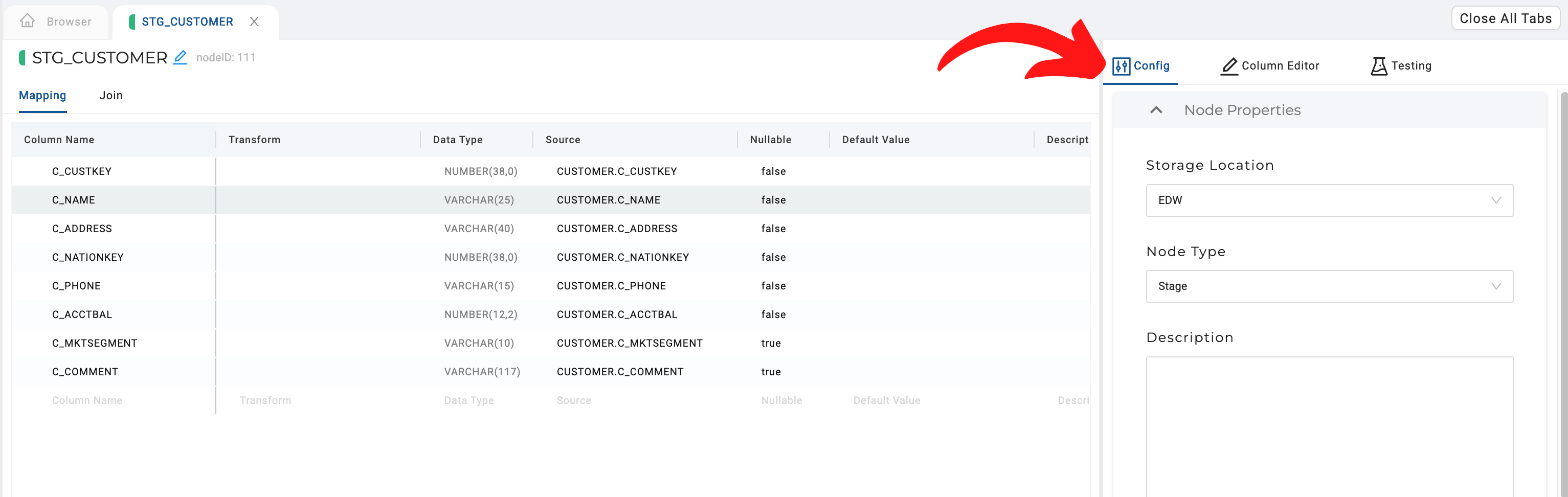
Node Properties
| Name | Description | Type |
|---|---|---|
| Location | Logical storage location representing the database and schema which are mapped in the Workspace/Environment's Storage Mappings. | String |
| Node Type | The name of the type of node. This could be user-defined or a core option. | String |
| Description | Description text about this specific node. | String |
| Deploy Enabled | This toggle determines if a node will be included in a deployment. By default, all nodes in a workspace are included in a deployment, this allows changing that behavior | Boolean |
If a Node exists on the target environment and deploy is disabled, the next deployment will cause that node's table to be dropped.
Re-Sync Non Source Columns
isColumnResyncEnabled: true
When set to true for a node, it enables a "Re-Sync Columns" button in the top-right corner of the Node’s mapping grid. It allows users to refresh column definitions.
- If a user deletes the columns in the mapping grid, then clicks "Re-Sync Columns," they will be prompted to add the deleted columns.
- If a user deletes a column in their data platform, then tries to re-sync the columns, they will be asked to delete the columns that were removed in the data platform.
Multi source nodes will not display the "Re-Sync Columns" button, even if the flag is enabled.
Core UI Elements
Core UI elements can't be edited or customized, but they can be combined with customizable elements for more functionality.
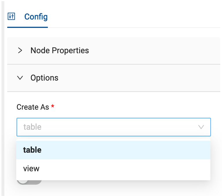
Materialization Selector or Create As
Determines if the Node will be materialized as a table or as a view. This influences how Coalesce will deploy and refresh this node.
config:
- groupName: 'My Config Group'
  items:
  - type: materializationSelector
    default: table
    options:
    - table
    - view
    isRequired: false
  enableIf: 'true'
| Name | Description | Type |
|---|---|---|
| displayName | The display name can't be changed. It will show as Create As. This field is read-only and doesn't need to be included in the configuration. | String |
| attributeName | node.materializationType. This field is read-only. The name used to access the data in this attribute. | String |
| isRequired | If this is required. | Boolean |
| default | The default selection. table or view | Boolean |
| options | Only table or view are valid unless using advancedDeployment strategies. | Object |
| enableIf | If true, display this config group, else hide this config group. Jinja expressions can be used in a quoted boolean for dynamic behavior. For example. (boolean string, 'true' | 'false', defaults 'true'\) | String |
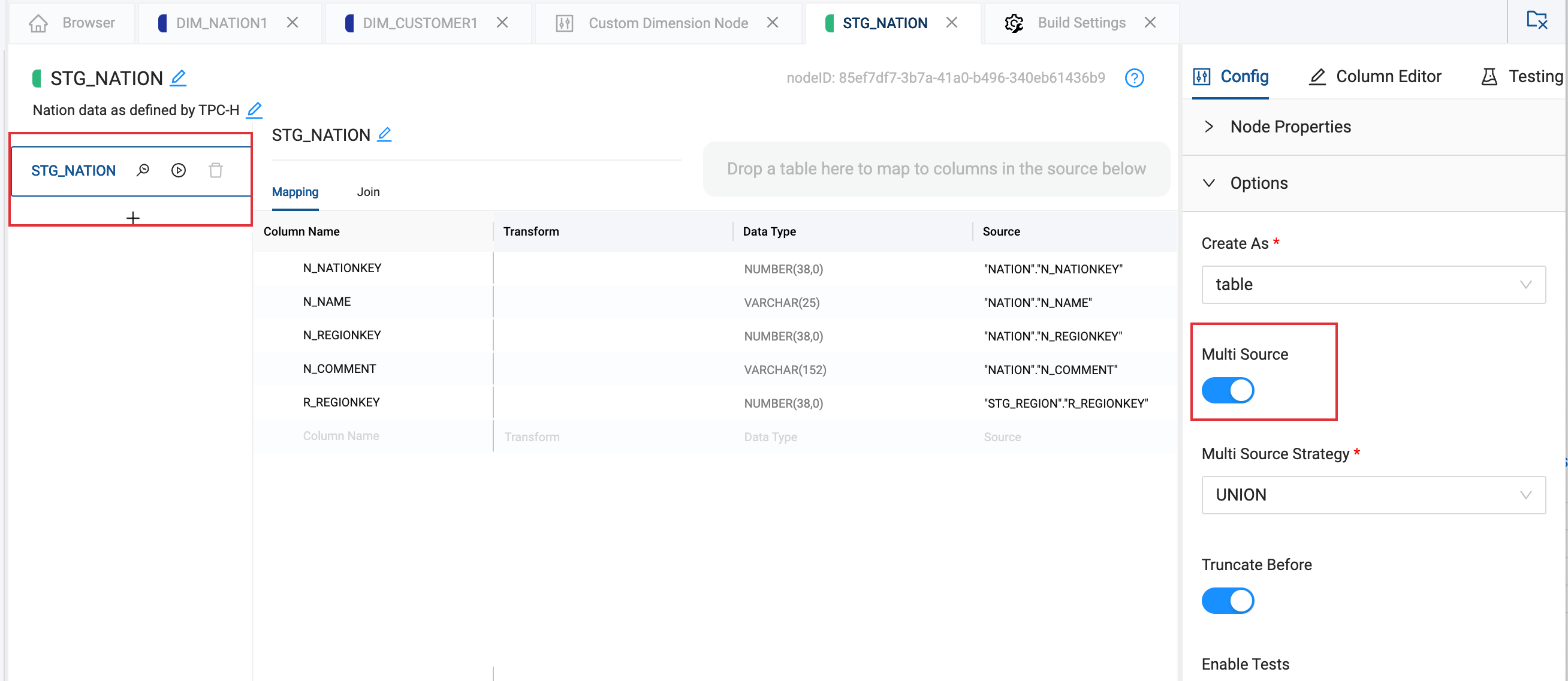
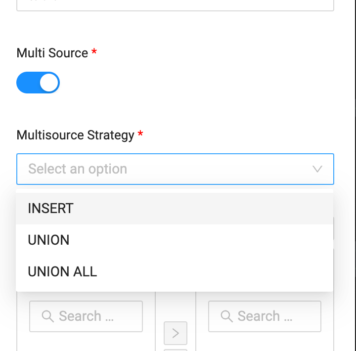
Multi-Source Toggle
Toggle that allows a Node to accept data from multiple sources by virtue of a SQL union, union all, or individual inserts. When this toggle is true, the mapping grid will allow for multiple source columns to be mapped to a single column in this Node. Combine the Multi-Source toggle with Multi-Source Strategy dropdown.
config:
- groupName: 'My Config Group'
  items:
  - type: multisourceToggle
    enableIf: 'true'
| Name | Description | Type |
|---|---|---|
| displayName | The display name can't be changed. It will show as Multi Source. This field is read-only and doesn't need to be included in the configuration. | String |
| attributeName | node.isMultisource. This field is read-only. The attribute name is used to access the data in this attribute. | String |
| enableIf | If true, display this config group, else hide this config group. Jinja expressions can be used in a quoted boolean for dynamic behavior. For example. (boolean string, 'true' | 'false', defaults 'true'\) | String |
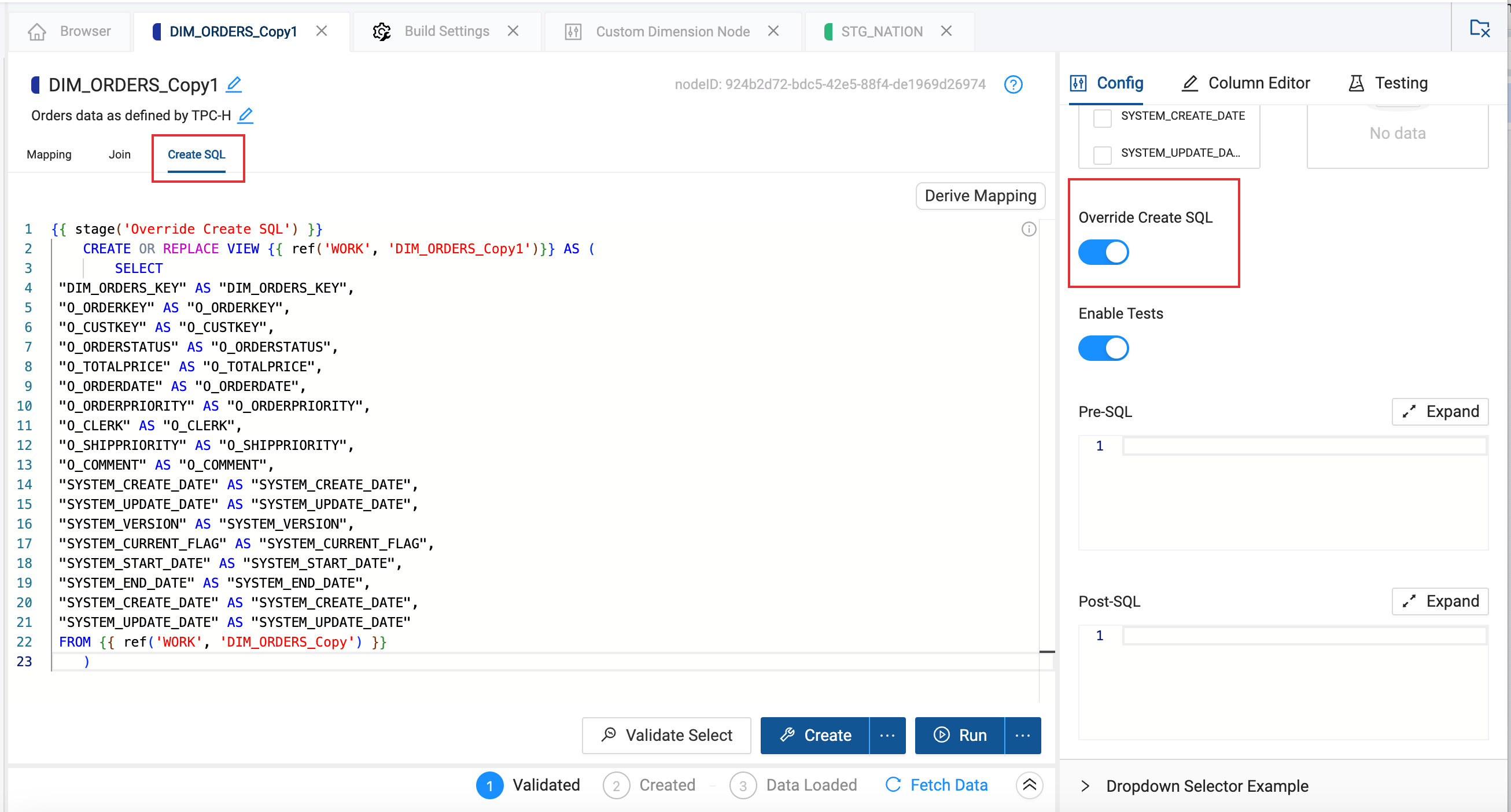
View DDL Override or Override Create SQL Toggle
This option is used when the materializationType is view. Override Create SQL allows a user to override the DDL of a view, enabling greater flexibility in view creation. This option enables a text box in the GUI for the user to write a custom view DDL. Jinja templating is supported in this text box using all of the Node's metadata.
config:
- groupName: 'My Config Group'
  items:
  - type: overrideSQLToggle
    enableIf: "{% if node.materializationType == 'view' %} true {% else %} false {% endif %}"
| Name | Description | Type |
|---|---|---|
| displayName | The display name can't be changed. It will show as Multi Source. This field is read-only and doesn't need to be included in the configuration. | String |
| attributeName | node.override.create.enabled. This field is read-only. The attribute name is used to access the data in this attribute. | String |
| enableIf | {% if node.materializationType == 'view' %} true {% else %} false {% endif %} | String |
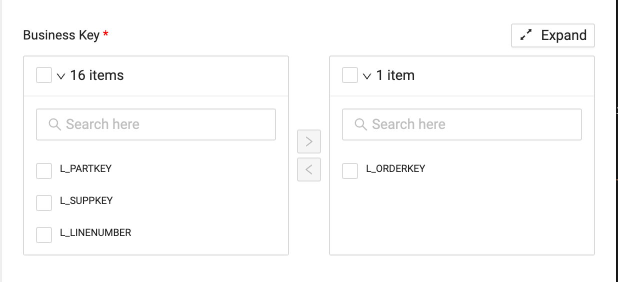
Business Key Selector
Selector that allows the user to specify the business or primary key columns in the Node. It will appear on column-level metadata.
config:
- groupName: 'My Config Group'
  items:
  - type: businessKeyColumns
    isRequired: true
    enableIf: 'true'
| Name | Description | Type |
|---|---|---|
| displayName | The display name can't be changed. It will show as Business Key. This field is read-only and doesn't need to be included in the configuration. | String |
| attributeName | isBusinessKey. This field is read-only. The attribute name is to access the data in this attribute. | String |
| isRequired | If the configuration is required. | Boolean |
| enableIf | If true, display this config group, else hide this config group. Jinja expressions can be used in a quoted boolean for dynamic behavior. For example. (boolean string, 'true' | 'false', defaults 'true'\) | String |
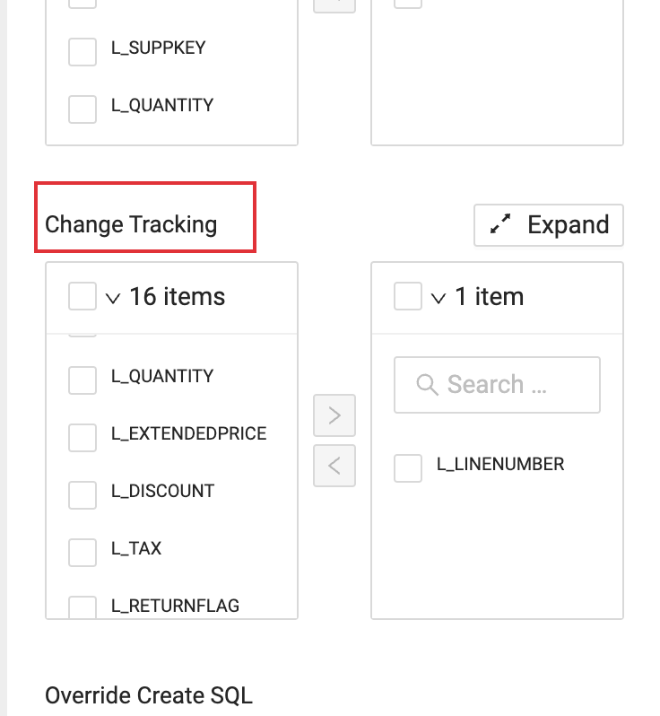
Change Tracking Selector
Selector that allows the user to specify the columns for which change tracking should be enabled. Typically this is used for slowly changing dimensions, but can be used for other applications.
config:
- groupName: 'My Config Group'
  items:
  - type: changeTrackingColumns
    isRequired: true
    enableIf: 'true'
| Name | Description | Type |
|---|---|---|
| displayName | The display name can't be changed. It will show as Change Tracking. This field is read-only and doesn't need to be included in the configuration. | String |
| attributeName | isChangeTracking. This field is read-only. The attribute name is to access the data in this attribute. | String |
| isRequired | If the configuration is required. | Boolean |
| enableIf | If true, display this config group, else hide this config group. Jinja expressions can be used in a quoted boolean for dynamic behavior. For example. (boolean string, 'true' | 'false', defaults 'true'\) | String |
Customizable Core UI Elements
Customizable core UI elements are generic elements that Coalesce uses in our Node Types. These can be customized by altering the displayName and attributeName.
Multi-Source Strategy Dropdown Selector
This is a dropdown selector that provides a choice of 3 strategies for combining multiple data sources. This is used when multisourceToggle is enabled.
config:
- groupName: 'My Config Group'
  items:
  - type: dropdownSelector
    displayName: Multisource Strategy
    attributeName: insertStrategy
    default: INSERT
    options:
    - INSERT
    - UNION
    - UNION ALL
    isRequired: true
    enableIf: 'true'
| Name | Description | Type |
|---|---|---|
| type | dropdownSelector | String |
| displayName | Name of the dropdown selector. Multisource Strategy | String |
| attributeName | insertStrategy. This is name that will show in the Node metadata and the name you'll use writing code. | String |
| default | INSERT The default selection. | String |
| options | INSERT, UNION, UNION ALL Options for the dropdown | String |
| isRequired | If the configuration is required. | Boolean |
| enableIf | If true, display this config group, else hide this config group. Jinja expressions can be used in a quoted boolean for dynamic behavior. For example. (boolean string, 'true' | 'false', defaults 'true'\) | String |
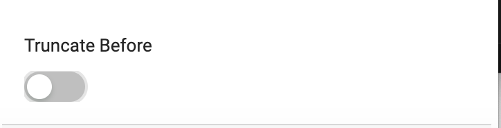
Truncate Before Toggle
This is a toggle button that determines if the data will be truncated before running this Node's INSERT script.
config:
- groupName: 'My Config Group'
  items:
  - displayName: Truncate Before
    attributeName: truncateBefore
    type: toggleButton
    default: true
    enableIf: 'true'
| Name | Description | Type |
|---|---|---|
| type | toggleButton | String |
| displayName | Name of the toggle. Truncate Before | String |
| attributeName | truncateBefore. This is name that will show in the Node metadata and the name you'll use writing code. | String |
| default | true The default selection. | String |
| enableIf | If true, display this config group, else hide this config group. Jinja expressions can be used in a quoted boolean for dynamic behavior. For example. (boolean string, 'true' | 'false', defaults 'true'\) | String |
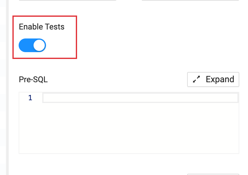
Enable Tests Toggle
This toggle determines if user created tests will be run as part of the Node's script. This does not remove Testing from the Node. Users can still enter in testing information, they won't be run in the script.
config:
- groupName: 'My Config Group'
  items:
  - type: toggleButton
    displayName: Enable Tests
    attributeName: testsEnabled
    default: true
    enableIf: 'true'
| Name | Description | Type |
|---|---|---|
| type | toggleButton | String |
| displayName | Name of the toggle. Enable Tests | String |
| attributeName | testsEnabled. This is name that will show in the Node metadata and the name you'll use writing code. | String |
| default | true The default selection. | String |
| enableIf | If true, display this config group, else hide this config group. Jinja expressions can be used in a quoted boolean for dynamic behavior. For example. (boolean string, 'true' | 'false', defaults 'true'\) | String |
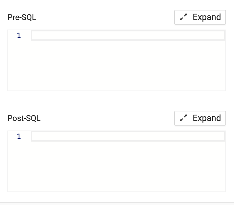
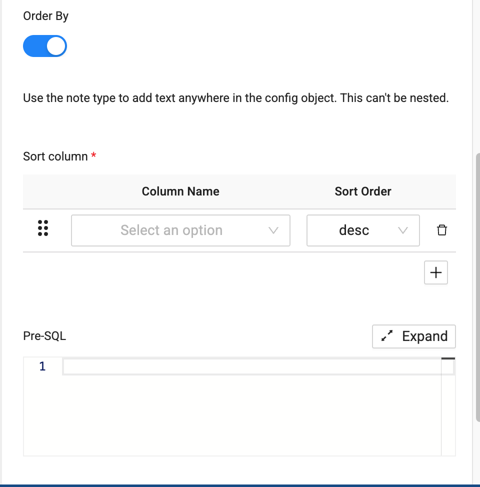
Pre and Post SQL Text Boxes
SQL text boxes that run before or after of the main DML operation.
config:
- groupName: 'My Config Group'
  items:
  - displayName: Pre-SQL
    attributeName: preSQL
    type: textBox
    syntax: sql
    isRequired: false
    enableIf: 'true'

  - displayName: Post-SQL
    attributeName: postSQL
    type: textBox
    syntax: sql
    isRequired: false
    enableIf: 'true'
| Name | Description | Type |
|---|---|---|
| type | textBox | String |
| displayName | Name of the toggle. Pre-SQL and Post-SQL | String |
| attributeName | preSQL, postSQL. This is name that will show in the Node metadata and the name you'll use writing code. | String |
| syntax | sql only. The syntax highlighting in text box. | String |
| isRequired | If this attribute is required. | Boolean |
| enableIf | If true, display this config group, else hide this config group. Jinja expressions can be used in a quoted boolean for dynamic behavior. For example. (boolean string, 'true' | 'false', defaults 'true'\) | String |
Generic UI Elements
Below is a comprehensive list of all user-defined items and their possible attributes. These are highly customizable, using both YAML either Jinja2.
Toggle Button
Defines a toggle button and its options for the node type. The metadata can be referenced in the config object using the attributeName.
- groupName: 'My Config Group'
  items:
  - type: toggleButton
    displayName: My Button
    attributeName: myButton
    isRequired: true
    enableIf: 'true'
| Name | Description | Type |
|---|---|---|
| type | toggleButton | String |
| displayName | Name of the toggle. | String |
| attributeName | A custom name. This is name that will show in the Node metadata and the name you'll use writing code. | String |
| isRequired | If this attribute is required. | Boolean |
| enableIf | If true, display this config group, else hide this config group. Jinja expressions can be used in a quoted boolean for dynamic behavior. For example. (boolean string, 'true' | 'false', defaults 'true'\) | String |
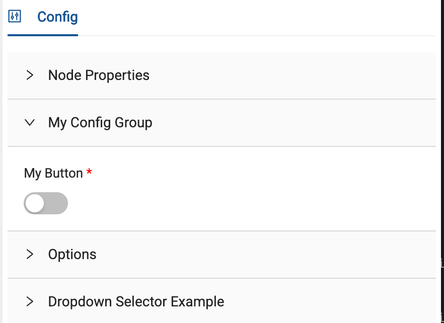
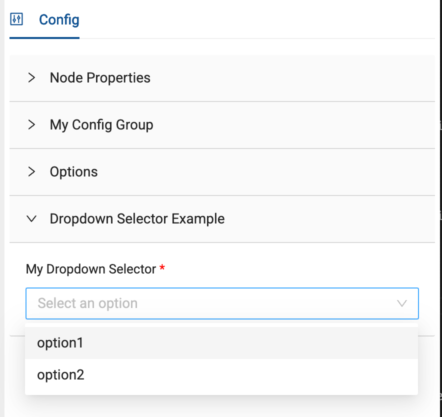
Dropdown Selector
Defines a dropdown selector and its options for the node type. The metadata can be referenced in the config object using the attributeName.
config:
- groupName: 'My Config Group'
  items:
  - type: dropdownSelector
    displayName: My Dropdown Selector
    attributeName: myDropdown
    default: option1
    options:
    - option1
    - option2
    isRequired: true
    enableIf: 'true'
| Name | Description | Type |
|---|---|---|
| type | dropdownSelector | String |
| displayName | Name of the dropdown selector. | String |
| attributeName | A custom name. This is name that will show in the Node metadata and the name you'll use writing code. | String |
| default | The default selection | String |
| options | The available dropdown options | String |
| isRequired | If this attribute is required. | Boolean |
| enableIf | If true, display this config group, else hide this config group. Jinja expressions can be used in a quoted boolean for dynamic behavior. For example. (boolean string, 'true' | 'false', defaults 'true'\) | String |
Column Dropdown Selector
Defines a dropdown selector using that Node's columns and its options for the Node type. The metadata can be referenced in the config object using the attributeName.
config:
- groupName: 'My Config Group'
  items:
  - type: columnDropdownSelector
    displayName: Column Name
    attributeName: myColumnDropdown
    isRequired: true
    enableIf: 'true'
| Name | Description | Type |
|---|---|---|
| type | columnDropdownSelector | String |
| displayName | Name of the column selector. | String |
| attributeName | A custom name. This is name that will show in the Node metadata and the name you'll use writing code. | String |
| isRequired | If this attribute is required. | Boolean |
| enableIf | If true, display this config group, else hide this config group. Jinja expressions can be used in a quoted boolean for dynamic behavior. For example. (boolean string, 'true' | 'false', defaults 'true'\) | String |
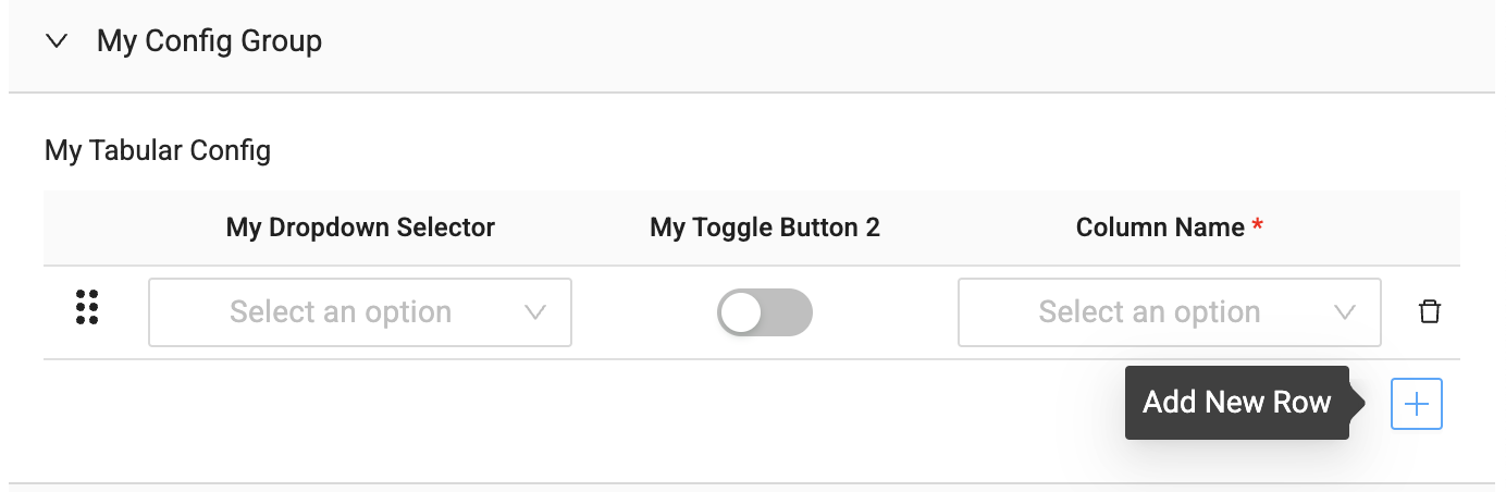
Tabular Configuration Component
A tabular structure for collecting metadata. Each column in the component can be one of several types including:
dropdownSelectortoggleButtoncolumnDropdownSelectortextBox
The metadata can be referenced in the config object using the attributeName.
config:
- groupName: 'My Config Group'
  items:
  - type: tabular
    displayName: My Tabular Config
    attributeName: myTabularConfig
    isRequired: false
    enableIf: 'true'

    columns:
    - type: dropdownSelector
      displayName: My Dropdown Selector
      attributeName: myDropdown
      options:
        - option1
        - option2
      isRequired: false
      enableIf: 'true'

    - type: toggleButton
      displayName: My Toggle Button 2
      attributeName: myToggleButton2
      isRequired: false
      enableIf: 'true'

    - type: columnDropdownSelector
      displayName: Column Name
      attributeName: myColumnDropdown
      isRequired: true
      enableIf: 'true'

    - type: textBox
      displayName: My Textbox
      attributeName: myTextbox
      syntax: sql
      isRequired: true
      enableIf: 'true'
| Name | Description | Type |
|---|---|---|
| type | tabular | String |
| displayName | Name of the tabular config. | String |
| attributeName | A custom name. This is name that will show in the Node metadata and the name you'll use writing code. | String |
| isRequired | If this attribute is required. | Boolean |
| enableIf | If true, display this config group, else hide this config group. Jinja expressions can be used in a quoted boolean for dynamic behavior. For example. (boolean string, 'true' | 'false', defaults 'true'\) | String |
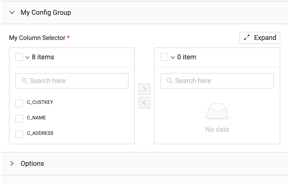
Column Selector
Defines a column selector transfer component. The metadata can be referenced at the column-level using the attributeName.
config:
- groupName: 'My Config Group'
  items:
  - type: columnSelector
    displayName: My Column Selector
    attributeName: myColumnSelector
    isRequired: true
    enableIf: 'true'
| Name | Description | Type |
|---|---|---|
| type | columnSelector | String |
| displayName | Name of the columnSelector config. | String |
| attributeName | A custom name. This is name that will show in the Node metadata and the name you'll use writing code. | String |
| isRequired | If this attribute is required. | Boolean |
| enableIf | If true, display this config group, else hide this config group. Jinja expressions can be used in a quoted boolean for dynamic behavior. For example. (boolean string, 'true' | 'false', defaults 'true'\) | String |
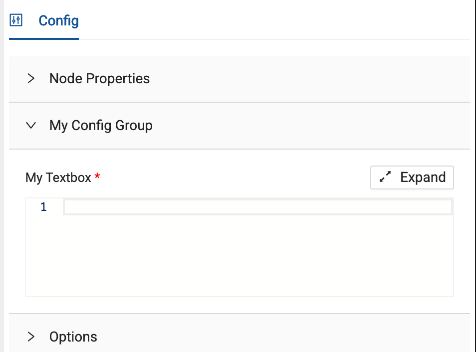
Text Box
Defines a text box and its options, with optional support for SQL syntax highlighting. The metadata can be referenced in the config object using the attributeName.
config:
- groupName: 'My Config Group'
  items:
  - type: textBox
    displayName: My Textbox
    attributeName: myTextbox
    syntax: sql
    isRequired: true
    enableIf: 'true'
| Name | Description | Type |
|---|---|---|
| type | textBox | String |
| displayName | Name of the textbox. Pre-SQL and Post-SQL | String |
| attributeName | A custom name. This is name that will show in the Node metadata and the name you'll use writing code. | String |
| syntax | sql only. The syntax highlighting in text box. | String |
| isRequired | If this attribute is required. | Boolean |
| enableIf | If true, display this config group, else hide this config group. Jinja expressions can be used in a quoted boolean for dynamic behavior. For example. (boolean string, 'true' | 'false', defaults 'true'\) | String |
Note
Add text anywhere in the config object. This can't be nested in other elements.
| Name | Description | Type |
|---|---|---|
| type | note | String |
| attributeName | A custom name. This is name that will show in the Node metadata and the name you'll use writing code. | String |
| displayName | Where you'll enter your custom text. | String |
| enableIf | Jinja expressions can be used in a quoted boolean for dynamic behavior. For example. (boolean string, 'true' | 'false', defaults 'true'\) | String |
  - type: note
    attributeName: note.attribute
    displayName: Add text here
    enableIf: "{% if node.materializationType == 'view' %} false {% else %} true {% endif %}"
System Columns
Append additional columns to a node on initialization.
systemColumns:
- displayName: system_column_name1
  attributeName: isSurrogateKey
  transform: "my sql transform"
  dataType: STRING
  placement: beginning
  nullable: true
  defaultValue: hello
  description: Some description
  enableIf: 'true'
| Name | Description | Type |
|---|---|---|
| systemColumns | Name of the array | Array |
| displayName | Name of the system column. {{NODE_NAME}} can be used to reference the name of the Node the column is generated for. | String |
| attributeName | A custom name. This is name that will show in the Node metadata and the name you'll use writing code. | String |
| transform | The initial transformation value. For example CAST(CURRENT_TIMESTAMP AS TIMESTAMP). | String |
| dataType | SQL data type | String |
| placement | beginning, end Determines placement of system column in relation to normal columns. | String |
| nullable | If null is allowed | Boolean |
| defaultValue | The default value | String |
| description | What goes in the field description | String |
| enableIf | If true, display this config group, else hide this config group. Jinja expressions can be used in a quoted boolean for dynamic behavior. For example. (boolean string, 'true' | 'false', defaults 'true'\) | String |
System columns are only added to a node when the node is first created on the graph. When adding new system columns to a UDN, these system columns will not immediately be available in the metadata of the current node you are editing.
In order for these changes to take effect, you must create a new node of this type on your graph. You must select this new node in the Node Type Editor to continue authoring it.
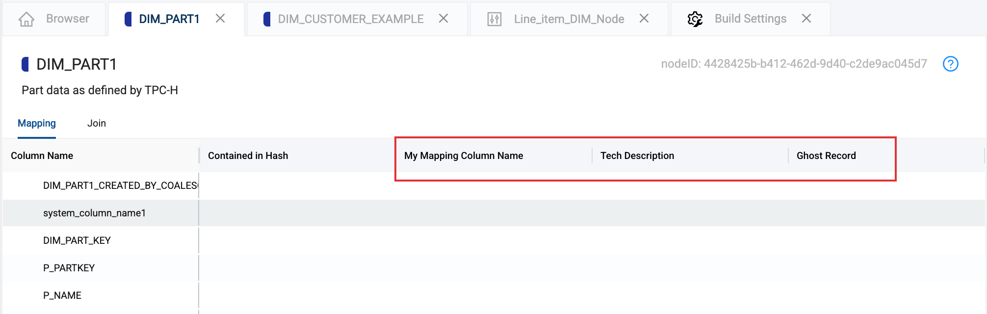
Mapping Columns
Append additional metadata columns to the mapping grid.
mappingColumns:
- headerName: My Mapping Column Name
  attributeName: myMappingColumn
  type: textBox
- headerName: Tech Description
  attributeName: techDesc
  type: textBox
- headerName: Ghost Record
  attributeName: ghostRecord
  type: textBox
| Name | Description | Type |
|---|---|---|
| mappingColumns | Name of the array | Array |
| headerName | Name of the system column. | String |
| attributeName | A custom name. This is name that will show in the Node metadata and the name you'll use writing code. | String |
| type | textbox is the only option. | String |